Thursday, 11 December 2014
L.P: Lesson 11th December
I spent today's lesson editing together one of the magazine advertisements. I started by using a still from our video, I used one of the stills with the animation over the characters because it creates that sense of mystery. I started by using the select tool on photoshop and electing the characters, allowing them to become different layers, I then blurred that background layer so that the characters stood out. The next step was adding on the title, when i played the picture on the word had a black background so i had to start by getting rid of this so that the words are just white. I wanted the words to be white so that the animated white lines on the characters would stand out more. Once I had taken away the black I resized the title with the transformation tool and placed it up in the left corner, I then used text to add in a title saying 'single out now', 'available on iTunes' and the web address to find snakehips music. I conventionally used lines on either side of the title saying 'single out now' to outline it.
Tuesday, 9 December 2014
L.P: Lesson 9th December
In todays lesson I edited and I put some of the animated clips onto the timeline, I replaced the ones we already had with our new clips making sure Isaac wasn't looking at the camera as we have decided he won't interact with the camera or the girls in the shots in London, as it's supposed to be his 'dream state'. The animation was my idea because I wasted to represent this dream world visually, I was inspired by disclosure, which links to the genre of dance music and a feeling of mystery. I was also inspired by Bombay Bicycle Club's music video to 'Carry Me'.
I also edited the ending, by changing the order and also making some of the clips a longer cutting rate as the music becomes really slow, and he's back to the 'unhappy' scenes. Also, it's the 'big reveal' where we show the gold over his face linking Isaac to the dancers, meaning that the shots need to be longer so that this can be understood.
Monday, 1 December 2014
Group: Roughcut and Feedback
> The lipsyncing should not be at the beginning because the audience should feel distant from him at this point.
> The beginning shots seem out of place because he is at the edge of the roof and then he is walking away from the edge and then back at the edge.
> The narrative is slightly unclear.
> The London shots are not clear that they are in his mind. They need to be more fantastical.
> On the rooftop it would be a good transition if we juxtapose shots of him closing his eyes on the rooftop and then he opens his eyes in London.
> The colour is too bright in London it needs to be richer.
> The ending shot could be one of him walking away from the edge so the conclusion is he walks away.
D.B: Digipak Progress Update
We had a discussion today about which aspects of the digipak mock ups we wanted to keep in the final edit.
In the second digipak edit we loved the fact that the outside was brightly colourful and then when the CD disk was opened it would be black and white/gold. The dance music genre and the feeling of the track is initially happy and is used to invoke joy therefore the initial appearance should match this. However, we have portrayed something deeper beneath the appearance of happiness and therefore the inside of the digipak could be black and white inside to visually demonstrate this.
This is an idea of what the final edit will look like
In the second digipak edit we loved the fact that the outside was brightly colourful and then when the CD disk was opened it would be black and white/gold. The dance music genre and the feeling of the track is initially happy and is used to invoke joy therefore the initial appearance should match this. However, we have portrayed something deeper beneath the appearance of happiness and therefore the inside of the digipak could be black and white inside to visually demonstrate this.
From the third digipak mock we want to take the Gold Snakehips Remix text that is written across the bottom of the front cover.
From the first digipak mock up we created we absolutely loved the front and back covers and I think we will use them in the final edit. The front cover is very conventional of Snakehips' meta narrative of their previous digipaks.
D.B: 28th November Lesson Update
Despite not having a lesson today I managed to go up to Tech during 1st Period, Lunch and afterschool so that we could meet our group's deadline for getting the rough cut done.
We were successful in meeting this deadline and although we are aware of many changes that are needed, we are on track to finishing the video by next Friday.
I cut together the ending of the track where Isaac is back on the rooftop. We wanted to repeat some shots from the beginning to create a recognition of how cyclical his emotions are so I copy and pasted the shot of the close up silhouette of his hand. I placed another shot after this one followed by the reveal shot of his hand showing the bracelet on his wrist. By juxtaposing the beginning shot of his hand with the reveal shot of the bracelet it links the 2 narratives of London and the rooftop.
The ending shot of the track is absolutely perfect and we will definitely keep it in. I copy and pasted the back tracking shot of Isaac facing away from the camera and compressed the time so that it fit with the fading out of the track. I then added a fade to black effect and increased the time it faded out so that as the track slowly faded out the clip slowly tracked away from Isaac and faded out also.
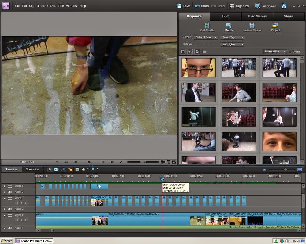 I cut the clips of the dancers and placed them on video 2 of the visual timeline above the clip of the track of Isaac picking up the bracelet. I decreased the opacity of the shot so that the clip underneath would show through. The cutting rate of the dancers is very fast so that the audience isn't completely sure of what they are seeing. This was necessary to blend in the full clip of the dancers because otherwise it seems out of place and like a mistake.
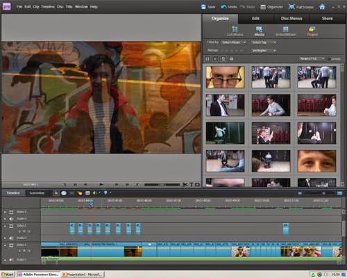 I used a similar technique earlier on in the video as well because whilst watching the video our narrative wasn't very clear and the 2 scenes didn't seem to connect. Overlaying seems to be working to link them together because now they seem present in their effect with each other.
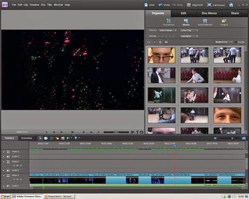 I placed the dancer shots that Laurel edited together in the blank space of the timeline during the conceptual part of the track. Some of the shots needed to be trimmed to fit the space and because the track slowed down at the end of the conceptual part I time stretched the last clip to be slow motion. We don't want this part to just be the dancers but we have not edited the green-screen kaleidoscope shots yet so we placed them here in order to finish the rough cut.]
There were a few clips, for example the one where the dancers disappear from Isaac and jump cut at an increasing cutting rate, that I had to drag and drop so that they were more in time with the music.
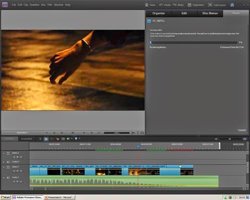
Before exporting the rough-cut we rendered the video and watched it through to look for any last minute changes or accidental placing of discarded clips. I moved the workbar area to the end of the track and then exported the clip to MPEG with a resolution of ... We will put the exported clip onto YouTube and the blog next week.
We were successful in meeting this deadline and although we are aware of many changes that are needed, we are on track to finishing the video by next Friday.

I cut together the ending of the track where Isaac is back on the rooftop. We wanted to repeat some shots from the beginning to create a recognition of how cyclical his emotions are so I copy and pasted the shot of the close up silhouette of his hand. I placed another shot after this one followed by the reveal shot of his hand showing the bracelet on his wrist. By juxtaposing the beginning shot of his hand with the reveal shot of the bracelet it links the 2 narratives of London and the rooftop.
The ending shot of the track is absolutely perfect and we will definitely keep it in. I copy and pasted the back tracking shot of Isaac facing away from the camera and compressed the time so that it fit with the fading out of the track. I then added a fade to black effect and increased the time it faded out so that as the track slowly faded out the clip slowly tracked away from Isaac and faded out also.
 I cut the clips of the dancers and placed them on video 2 of the visual timeline above the clip of the track of Isaac picking up the bracelet. I decreased the opacity of the shot so that the clip underneath would show through. The cutting rate of the dancers is very fast so that the audience isn't completely sure of what they are seeing. This was necessary to blend in the full clip of the dancers because otherwise it seems out of place and like a mistake.
  I used a similar technique earlier on in the video as well because whilst watching the video our narrative wasn't very clear and the 2 scenes didn't seem to connect. Overlaying seems to be working to link them together because now they seem present in their effect with each other.
 I placed the dancer shots that Laurel edited together in the blank space of the timeline during the conceptual part of the track. Some of the shots needed to be trimmed to fit the space and because the track slowed down at the end of the conceptual part I time stretched the last clip to be slow motion. We don't want this part to just be the dancers but we have not edited the green-screen kaleidoscope shots yet so we placed them here in order to finish the rough cut.]
There were a few clips, for example the one where the dancers disappear from Isaac and jump cut at an increasing cutting rate, that I had to drag and drop so that they were more in time with the music.
Before exporting the rough-cut we rendered the video and watched it through to look for any last minute changes or accidental placing of discarded clips. I moved the workbar area to the end of the track and then exported the clip to MPEG with a resolution of ... We will put the exported clip onto YouTube and the blog next week.
Subscribe to:
Comments (Atom)


